Exploratory Data Analysis
In this page, we will show some data visulization to explore the interesting key insights in this dataset.
Approach description
For all the visulizations, I utilized the Python language with the famous vislulization packages, "MatPlotlib" and "Searborn" to achieve our goals.
Home Ownership vs Interest Rate
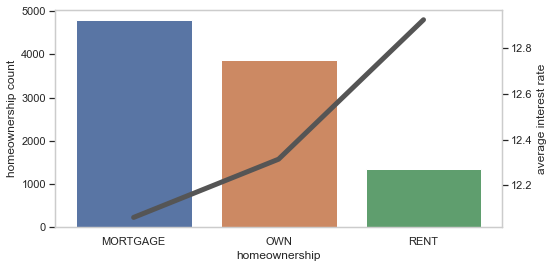
From this plot, we can see that "Mortgage" is the most home ownership type and with the lowest interest rate; On the other hand, the rent is the less home ownership type but with the highest interest rate.
Loan purpose count
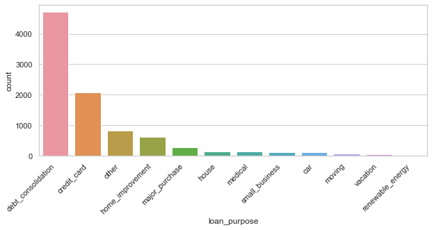
From the barchart, we can observe that the "debt consolidation" is the reason the most loan applications will apply the loan for, and the second one is the loan for "credit card", but it still even don't hit the half of the first place.
Loan amount vs Loan status
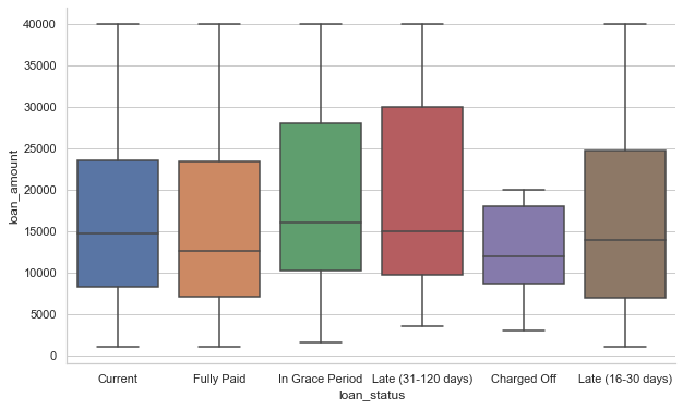
From the box plot, we can see that "Fully paid" status has the low medium loan amount overall; on the other hand, we can observe that the status "Late (31 - 120 days)" and "In Grace Period" have relatively higher loan amount, even include the higher minimum. There is another thing we can detect on this plot, we can assume that the higest loan from this company is 40000, since we can observe that the maximum amount for all categories are the same at $40,000.
Interest Rate vs Grade
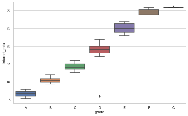
From this plot, it's pretty obvious that the interest rate has high correlation with the grade, from this plot, we assume that the grad has a ordinal relationship between the grades, so we can assume that grade A is the customers who have been classified as the greatest applicants, so that they can enjoy the lowest interest rate, on the contrast, we can assume that the grad F is the applicants who nave the worst records/histories so that they should afford the highest interest rate.
Histogram of the Loan Amount
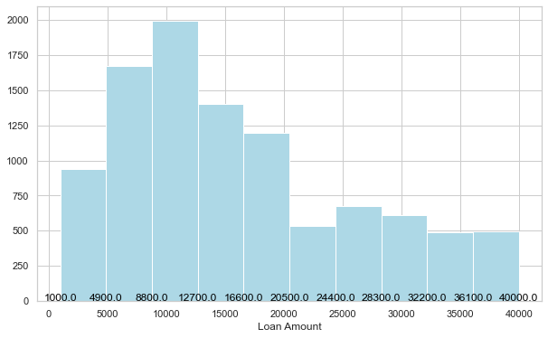
From the histogram, we can find that the most loan amount is located between $8800 and $12700.