Data Visualization
This page will show you some data visulization about the customer orders data, and we can see some key insights easily based on the visualization.
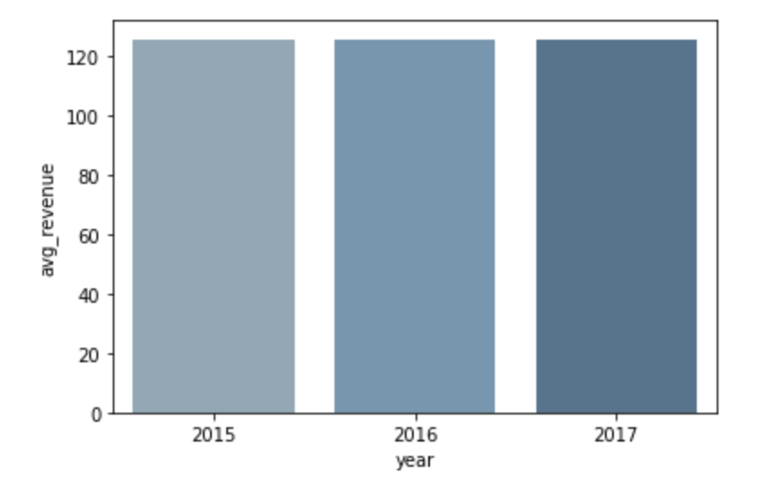
1. Avrage revenue for each year

From the bar chart, we can see that the average revenue doesn't have big difference between each year.
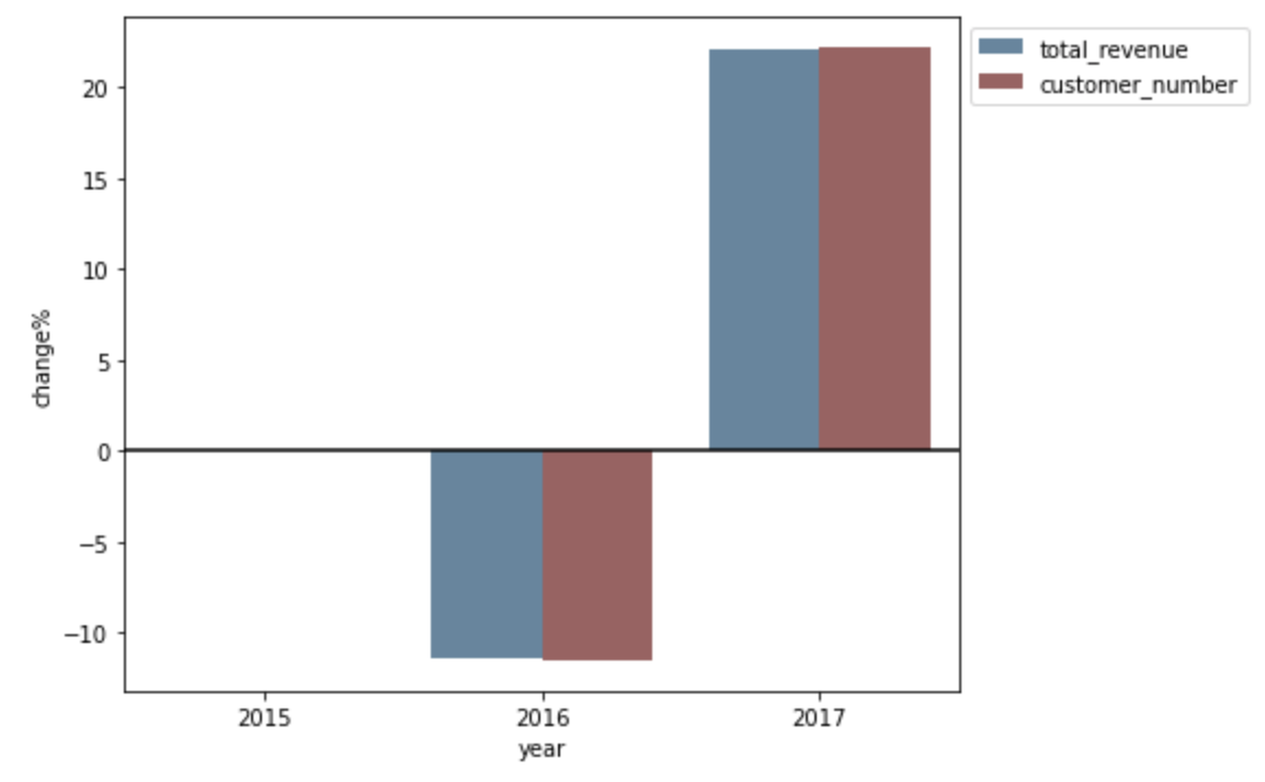
2. New Customer Revenue e.g. new customers not present in previous year only

From the chart, we can see the revenue and customer's growth, and they both went the same direction, decreased in 2016 and grew in 2017.
3. The total revenue and percentage of the revenue came from

From the bar chart, we can easily observe that who brang the revenue. We can see in the 2016 and 2017 years, new customer both brang more than 50% of our total revenue.